Very pleased with the final outcome, and so was the client.
In all this included:
An updated CV,
Artists Statement,
Leisure Interests,
Work Experiences,
Letterhead,
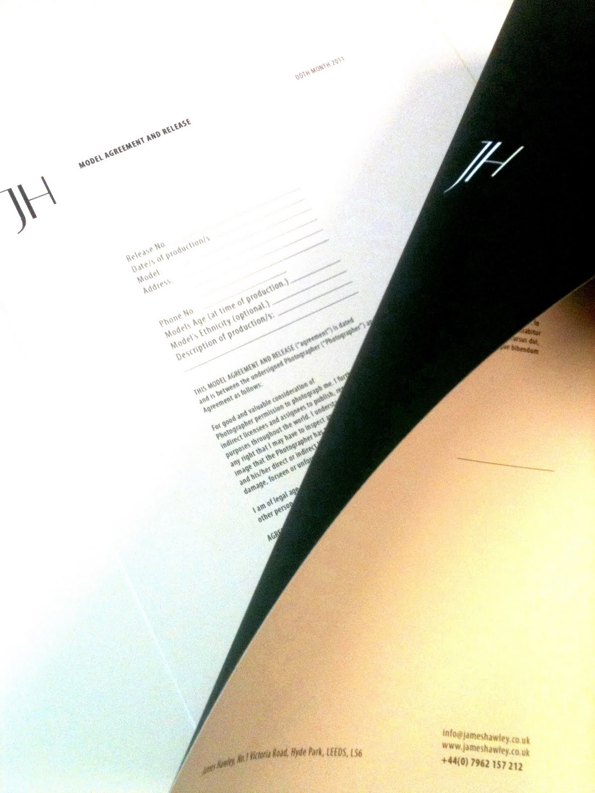
Model Release Form,
Estimate/Invoice,
Business Cards (held within this folder)
The main function of this pack was so that these pieces of information were bound with ribbon so that these could be organised custom to their needs, However for this particular brief the client, A Photographer, needed to present this information as part of their Personal Professional Development, Then presented to her tutors and fellow students.
Christine received great feedback from what was presented to her tutors and with this I feel has been confidence boost in what she loves to do.

The Business cards were a one off foil print, however could be easily printed professionally. The type is also produced in the same method and clear to read.